ShopDreamUp AI ArtDreamUp
Deviation Actions


Suggested Collections


You Might Like…


Featured in Groups


Description
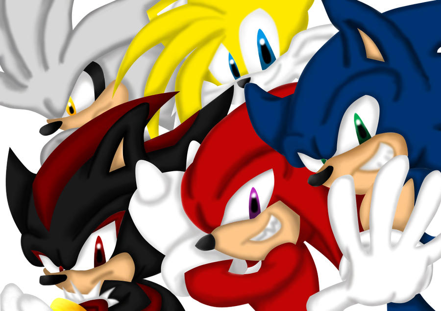
 sketch colored by me with her permission. In my new lineless coloring style
I left the background white, because I didn't want to make the picture anymore more crowded or colorful then it already is. I'm really happy with how the coloring came out, but I'm still getting used to this lineless coloring style. It takes a lot longer than how I normally color.
I'd love to hear any feedback you got. But only for the coloring since ~shAdZAsilHouEtTeZ did the sketch.
Sketch done by ~shAdZAsilHouEtTeZ
Coloring done by *Angel-Hearted-Being
Characters belong to SEGA
Image size
1065x750px 362.97 KB
© 2011 - 2024 Crescent-Winged
Comments60
Join the community to add your comment. Already a deviant? Log In
The first thing that strikes me about your colouring is that the dividing lines between objects of the same colour are not very well defined. Even with a lineless style, the edges of shapes should be clearly visable. Examine, for example, the lower edge of Knux's arm, or the lines/edges between the strands of Silver's spikes/hair, or any character's eyebrows. There is no reason why the edges of these shapes should become blurred to obscurity but that seems to be what you have done here in some areas.
I think part of this problem stems from not having a clearly defined light source, and therefore, having little direction when it comes to shadow placement ("shadow", as in areas that are not lit - NOT the hedgehog, hehe). For example, normally, the dividing edge between Knux's arm and his body, would be more visable and well defined, because his arm would be casting a larger, more prominant shadow onto his body.
I recommend looking at some other lineless work, to see how other artists do it, but also remember that the rules of regular ie. lined artwork still apply here (and the rules that apply here also apply there).
Here is a rather good example of a lineless artwork done well: [link]
Notice how the shadows are more prominant on one side of the character's body than the other. We have no problem guessing where the light source is. Shapes are solid, and clearly defined, so that we can make them out clearly.
Now, I also want to talk about highlights. Adding some highlights to shiny areas like the noses and eyes is a good idea, and I see you did it with the eyes already, but not the noses, so it looks as though the characters have dried out noses (are hedgehogs and echidnas meant to have a wet or dry nose? I'm sure foxes are meant to have a wet nose, a fox is like a dog hehe -- but they seem to have shinier noses in official art). Another thing to remember with highlights is that wet areas will have sharper, brigher highlights, and dry areas will have more subtle highlights. The shiny white dots you added to their eyes looks good, but you could make it more sharply defined to give them that wet look (now I know that all these creatures SHOULD have wet eyes!). It might also be nice to see some softer, more subtle highlights in other areas of the picture. I'm sure that the light could catch their hair/fur and enable you to brighten them up a little bit more! I understand, if you do not want the brightness to become overbearing, but a little subtle highlight won't hurt. (Besides which, with digital art, you can try out anything you like, and undo it if it looks rubbish!)
Anyway, altogether, good work, and good potential, but I think you can improve. And once you do, you'll be able to produce really amazing work! I hope you found this helpful. Please ignore the ratings, I do not know how to rate anybody's art.